Green Box - Deposit/Return App
Helping diners switch from single-use to reusable containers takes the waste out of takeout
Role
UX Designer, Project Lead (with mentorship from 2 senior UX designers)
Timeline
6 Weeks (Nov-Dec 2022)
Tools
Figma, Figjam
Deliverables
Project Plan, Research Plan, Competitor Analysis, Secondary Research, User Interviews, User Flows, Sketches, Style Guide, Low Fidelity Wireframes, High Fidelity Mockups, Prototyping, User Testing, Next Steps & Recommendations
To comply with my non-disclosure agreement, some information in this case study has been omitted and obfuscated.
The Challenge
For Customers
When ordering food for takeout, customers pay a deposit for food containers but don’t have a way to return them and get a deposit refund.
For The Business
Green Box isn’t achieving their goal of zero waste: 30-40% of reusables aren’t returning to the reuse loop.
The Solution
A mobile application customers use to return reusables by scanning QR codes, and transfer deposit refunds back to an account of their choice.
Company Background & Project Goal
On a mission to make zero waste easy for companies and consumers, Green Box supplies reusable takeout containers to restaurants. Customers pay a deposit for each container and return containers at drop off locations.
Green Box contracted our design team to create:
An intuitive return process
A way for customers to receive a refund for their new reuse model
Something they can show to investors to demonstrate how their new model works
As a team of two designers working part time over 6 weeks, our goal was to test a high fidelity proof of concept prototype, and outline next steps and recommendation. We followed the 5-step Design Thinking framework to ground design decisions in user needs and research.
Project Kickoff
Project Kickoff
Hit The Brakes: The Scope Changed on Day 1
We were briefed on improving the existing app, but during kickoff discovered Green Box was using a new business model and direction.
Since there were many avenues the project could take, I knew we needed to define a new project and prioritize its scope quickly - one that’s impactful for the client to show to potential investors, and still achievable by a team of 2 part-time contractors in 6 weeks.
Project Kickoff
Redefining: Stakeholder Interviews to a Future-State [Journey Map]
Since we were pivoting to a new project, I took the lead on conducting stakeholder interviews for a deep dive into the new model.
Since the new business model wasn’t defined or in use yet, I created a future-state journey map to chart the path customers will take, and define the assumptions we’ll have to make in order to get them there. This visual tool quickly aligned the team, the stakeholders loved it, and the newfound clarity gave the project momentum.
Project Kickoff
Good To Go: A Plan, Constraints & Assumption
We defined the new project by clarifying business needs and aligning the team on constraints and assumptions.
Discussing how reusable containers work during a stakeholder interview.
Business Needs
User accounts to track return quantities, return locations, and more
Users need to scan the QR code on drop off bins
Users can withdraw refunds to Apply Pay, Google Pay, or a bank account
Customer Needs
User account to count and track returns, check and process refunds, store payment info
Assumptions
All takeout comes in reusable containers (whether ordered online or in-person)
There is a QR code on each container
Customers can return containers at all existing drop off locations
The return process is separate from ordering/check-out, so no customer data is available until returns are made
Refunds are not immediate (processing time allows for Green Box to verify containers returned to the warehouse)
Project Organization
Standing schedule for designers & stakeholder meetings
Kanban board
Project Plan (internal and external versions)
Research Plan
Understanding The Problem
Understanding The Problem
Competitive Research
How do similar return models work? What helps users adopt them?
We reviewed 12+ competitors from reusable food and beverage companies, urban bike and scooter rentals, to bottle returns. I also explored how apps like Bank of America, Depop, and Venmo help users withdraw funds.
“...people are more willing to engage with systems with which they are already familiar, indicating that [future solutions] should involve consumers trialing a system or have it demonstrated to them.” - source
Show & Don’t Tell
The Vytal app uses real photos, minimal text, and demonstrates the interactions customers will experience
Short & Sweet Returns
CLUBZER0’s app scan/return process is clear and minimal

Purpose Is Powerful
Ridwell app’s shows the environmental impact of the user's actions
Understanding The Problem
Gathering Requirements: I Tried The Return Process Myself
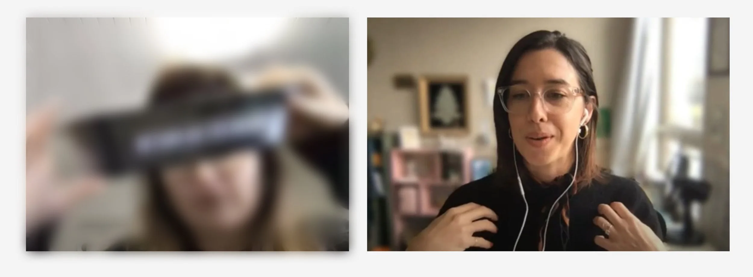
I wanted to understand the physical interactions that take place during the return process, so I tested the usability of Green Box’s current app by returning reusables at a local drop off location. This also helped me empathize more deeply with customers during interviews, which followed next.
I tried returning a reusable to a drop off location. (Some information, including screenshots of their app, have been redacted).
Digital Usability Issues
No visibility of system status
When I scanned the QR code on the drop off bin, the app updated so fast I had no idea what happened. Did I make a return? How many items did it track?
Lack of user control
How do I restart the process since I’m not sure it worked?
Physical Interactions
Carrying container(s) to the drop off bin
Holding the container(s) while opening the app and scanning the QR code on the drop off bin
Holding the container(s) OR finding a place to set them down in order to scan each one with the app
Putting the phone down or in my pocket in order to open the drop off bin and put the container inside
Understanding The Problem
User Research: Customer Interviews
Since the return process is the same in Green Box’s current business model and the new model, we identified the opportunity to conduct user interviews with current customers for insights about returns.
Conversations with 7 customers revealed frustration, confusion, and the workarounds they used.
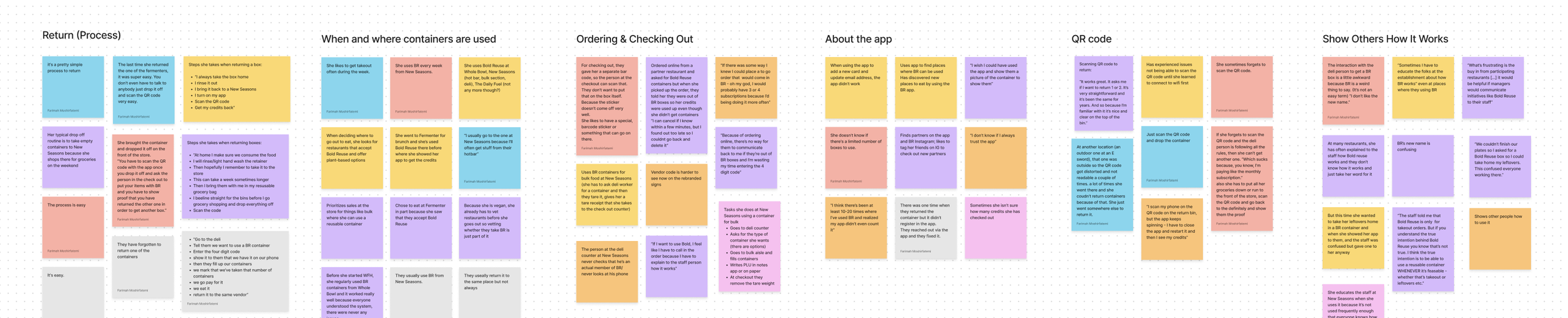
Finding common patterns and pain points using an affinity map
“I don’t know if I always trust the app.”
- Interview with current customer
Issues with the app
They don’t know how many reusables they checked out and returned
Scanning QR codes only worked if connected to wifi
The timing to receive a refund was unknown
Behaviors, habits & workarounds
They didn’t know if QR codes scanned successfully. Sometimes they closed and reopened the app in order to “refresh” it
They explained and demonstrated how the process worked to restaurant employees in order to access reusables
They always returned containers to the same drop off location
Finding A Solution
Finding A Solution
Ideating: How Might We…
These generative questions were our bridge from research to ideating:
How might we help customers adopt a new return process?
How might we make returning and withdrawing refunds a confident, intuitive experience?
How might we help customers see the environmental impact of their actions?
Finding A Solution
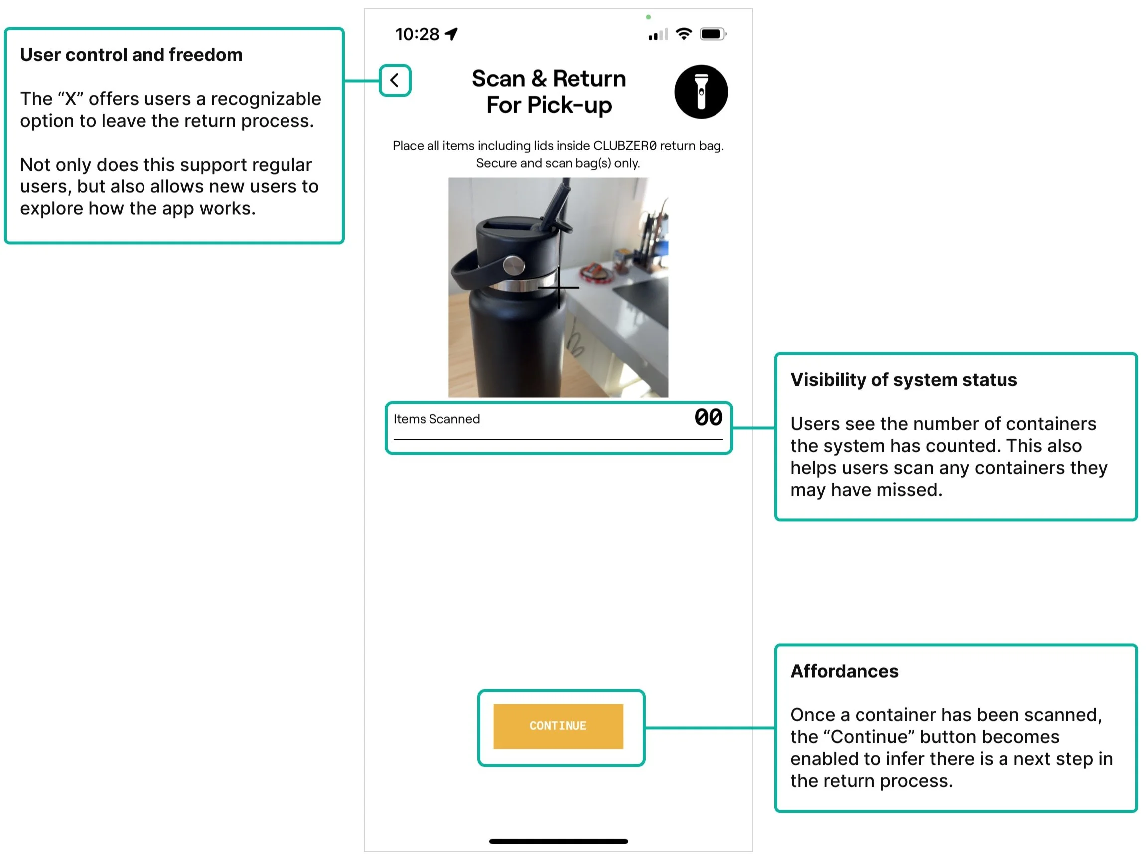
User Flows: Structuring Easier Returns
Goal: simplify the experience by reducing user actions/input, and have the system conduct its own checks and provide timely prompts.
We defined the minimum viable product (MVP) for the prototype based on the most important goals of customers and Green Box, and used these red routes as the foundation for user flows:
Onboarding that demonstrates how it works & creating an account
Returning containers and initiating a refund
Withdrawing the refund
“As a first time user, I want to return takeout containers”
A section of the return user flow focusing on scanning containers.
Finding A Solution
From Sketches To A Design System & High Fidelity
Because our goal was a high fidelity prototype on a short timeline, we moved quickly from sketches to high fidelity by parallel sketching to explore different approaches, improvised on each other’s designs, and then combined the “best-of’s” into digital wireframes.
Ideating on paper and the beginning of low fidelity flows.
Once we incorporated feedback from our stakeholders, we divided the screens between us and created a foundational design system with styles, components, and template screens. We updated some of the brand’s palette to meet accessibility standards.
These guidelines made quick, consistent work out of revisions resulting in a more cohesive high fidelity design. I also wanted to ensure that future designers who work on this project could pick up where we left off, making sure that the next round of iterations and testing happen smoothly.
Home Screen & Reminders
Scanning
Withdrawing
Testing The Solution
Testing The Solution
Usability Testing & Results
Five out of 6 participants successfully completed test tasks and understood the process. Some interactions in the prototype that were meant to mimic scanning a QR code caused confusion, but didn’t interfere with overall usability.


Testing The Solution
System Usability Score (SUS): 84 (good/excellent)
From a tester’s perspective, how usable was our prototype? Following each test session, each participant filled it a survey with standard SUS questions which automatically populated a spreadsheet and calculated the final score.
While we understand a score of 84 doesn’t explain specific issues, what it does provide is feedback that, overall, the app and its patterns and flow were usable, a foundation for future iterations.
Try The Prototype
Takeaways
Takeaways
Next Steps
Demonstrate the model with real examples. Show first time users what drop bins and containers actually look like.
Use clear and consistent language. Define terms with which users are familiar, introduce them during onboarding/model demonstration, and use them consistently through the return flow.
Retest. Since remote usability testing doesn’t account for the physical experience of scanning and returning, we recommended retesting with 2 different groups:
Participants who are unfamiliar with Green Box and the deposit-return model
Existing customers who are familiar with Green Box and reusables.
Takeaways
Opportunities
Include ordering. A model that includes ordering tracks when a customer places an order, so we’d know when to send reminders and incentives (for ex. a loyalty program, using refunds towards a next purchase, combining impact (behavior) and incentive (reward)), and tailor them to customers with different experience levels. As Yu-Kai Chou explains in Octalysis, “Most people treat their product as one experience. [...] ...this is a mistake because the reason you’re using the product on Day 1 is different from Day 100.”
Help customers adopt the model. The bigger goal than returns and refunds is encouraging customers to adopt a completely new behavior (the deposit-return model) in the first place. Apply principles of behavioral psychology in future designs to guide adoption. For example, the intention-behavior gap, how semantics affect influence behavior, and more.
Takeaways
Lessons Learned
Small changes = big impact on user confidence. For example, a simple temporary pop-up that confirmed the user had successfully linked their bank account.
Collaborating on a design team is rewarding. Initially I was unsure how this would go, but after making deliverables individually then collaborating on final versions, I looked forward to our review meetings and getting feedback. I learned to be strategic about the revisions for which I wanted to advocate, prioritizing the ones that would impact users and/or business needs the most. Working side-by-side on designs in Figma was a blast - I loved iterating on the fly and building on ideas together. The back-and-forth gave me a lot of energy and I learned a lot from my teammate, especially by listening closely and staying open.
Minimize scope creep early. The project was entirely different from the brief, which meant the foundational research we anticipated for the initial project simply didn’t exist. I enjoyed stepping up to distill ambiguity into a project plan, and learned how to pivot quickly when we lost a third team member, and adapt the plan for a team of two.
Communicating visually is powerful. During discovery, I saw that conversations alone weren’t providing the clarity we needed so I made a future-state journey map (I actually didn’t know what this was called, but I sensed that showing the experience would validate our collective understanding). The map made everything “click” for our team and the stakeholders, and the project progressed quickly from there.
Prototyping is its own skill. I would have constructed the prototype differently but it wasn’t my role in the project. Nonetheless, I learned a lot when interactions in the prototype didn’t help the user understand their actions. Ultimately we need to test the screens, the prototype, and the context, so it makes sense that while the screens themselves were navigable, we can’t know exactly how it actually meets the user's needs without testing in context with a revised prototype. While I expected the first round of testing to “fail” in this regard, what I learned was the value, skill, and nuance of prototyping, and I’m excited to do it again.
Design Is Collaborative
Thank You —
I’m grateful to my mentors, teammates, colleagues, and friends for their invaluable feedback on this project:
Rebekka Z., Jamie W., Tatiana C., Leeonn B., Farimah M., Taylor G., Greg G., Mo G., Bill R., Michael H., Umesh K., Nancy L., Steven C., and readers like you.