Sorted - Recycling App
How A Familiar Search Simplifies Recycling
At A Glance
My Role - UX Research, UX Design, Visual Design (with mentorship from senior UX designers)
Timeline - 4 Months
Platform - Mobile (iOS)
Tools - Figma, Figjam, Miro, Marvel POP
Deliverables - Competitor Analysis, User Interviews, Secondary Research, Personas, Storyboard, User Flows, Sketching, Paper Prototype, Wireframes, High Fidelity Mockups, Style Guide, High Fidelity Prototype, Usability Testing
The Challenge
There are many ways to recycle in sustainability-obsessed Portland, OR and each service has its own guidelines. As a result, eco-conscious residents are tasked with being an expert on the guidelines for each, most of which are more exception than the rule.
The Solution
Sorted unifies complex recycling guidelines from multiple services into a single quick-reference mobile app. Sorted reduces cognitive load by using a familiar visual search pattern that mirrors how users actually search, and gets them to the answer faster.
Designed For How People Search
Visual search instead of deciphering complex recycling rules
Verified by a subject matter expert, Portland’s most-searched for items are displayed first
The Right Details at the Right Time
Users can save items and create their own quick-reference guide
Instructions for how to prepare items are simplified and made for skimming
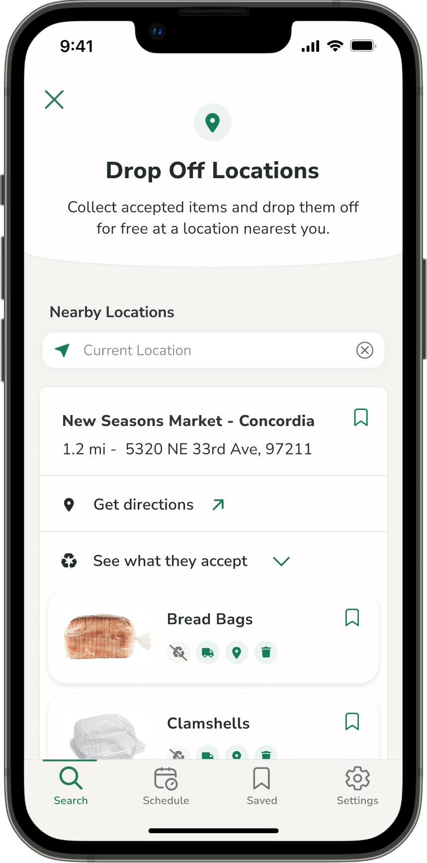
All Disposal Options In One Place
Sorted provides guidelines to all available recycling services, not just curbside bins
Power users see where an item goes at a glance, and new users can tap an option for detailed instructions
Secondary Research
Recycling in Portland is widely available, yet complicated due to guidelines like sorting by shape and size (ex. 6 oz and larger)
Residents are tasked with being specialists: they’re supposed to remember and/or consult extensive guidelines and where there are often more exceptions than the rule. Guidelines for each are complex, differ in design, and are located in different places.
“Curbside recycling efforts have made an important contribution to waste containment, but many communities have specific limitations on what products can be recycled within their community bins and must rely on depots for recycling these other items…”
Heuristic Evaluation
Recycling guidelines, apps, and instructions have poor usability heuristics
Guidelines fail to help users recognize instead of recall, or make a match to the real world with images and language.
“… perceived ease of use could directly promote waste sorting intention and behavior.”
Portland’s Recycle Bin Guide
Recognition rather than recall
Instructions for specific items are separate from the image, requiring users to match the rule to the item
Recognition rather than recall
While top-level categories are scannable, they assume the user knows what category the item(s) they’re looking for belong
Sub-categories include less common materials and confusing use of icons - colors don’t correlate to the color of icons for individual materials.
Match to the real world
Lack of photos results in a wall of text that isn’t easily scannable
Match to the real world
Material names may be hard to recognize
User Interviews
“Just tell me where it goes. I can’t hold this many things in my brain” - Portland Resident
From 145 survey responses, interviews with 8 residents revealed that they’re confused about the same items, and want to recycle but can’t retain all the rules.
Pain Points
“Containers/labels say 100% recyclable, but they’re not recyclable here”
Plastic is the most complicated and confusing material to recycle
Guidelines are inconvenient to access
All mentioned the same “difficult to remember” items they look up repeatedly
Accumulated items take up space in their homes
Behaviors
Put items into recycling they aren’t sure can be recycled: “I hope that it gets to the right place, but I have no idea what it’s like beyond the bins”
They spend a lot of time dealing with recycling
Most consult more than 1 recycling guideline
Collect/accumulate items that require drop off
Guidelines Consulted
“I wish I didn’t have to think about it so much”
Website: City/Metro, specialists such as Ridwell, James Recycling
Brochure: City/Metro
IG: Recycle or Not
User Persona
Meet Anna, the personification of Portland residents who recycle
Anna represents one group of residents committed to recycling and willing to endure some extra steps or complexity to make it happen.
How Might We Statements & User Flows
Defining the shortest path to answer Anna’s main pain point: “Where do I put this?!”
From these How Might We questions:
… make it easy for Anna to find recycling guidelines?
… put the right items in the right place?
… connect convenience to waste reduction?
… help Anna discover new waste solutions?
… To choosing Anna’s essential tasks/goals:
Search for an item
Add an item to a Saved list
Sketching & Hallway Testing
Testing initial sketches: participants didn’t know where to start and felt uncertain
Early designs assumed they would start searching based on the bin an item should go in, or what material it’s made out of:
What participants said when searching started with a bin:
“I’m not sure what bin this goes in.”
“If it’s not accepted in Portland’s bin, can it be recycled somewhere else?”
What participants said when searching started with a bin:
“I’m not sure what bin this goes in.”
“If it’s not accepted in Portland’s bin, can it be recycled somewhere else?”
Sketching & Hallway Testing
Breakthrough: returning to interviews, research, and a storyboard helped me redesign for how Anna actually searches
I drew a storyboard to fire up my empathy and re-focus on the people for which I’m designing, and then it clicked: Anna’s looking for a visual match to the item she’s trying to recycle.
I explored the UI patterns of popular search-based apps, and started thinking about recycling like food delivery or pick up instead of complex rules — Anna’s going to get her stuff picked up, or she’s going to take it somewhere to drop it off.
Then I redesigned the search to rely on visual recognition rather than recalling recycling rules for a given bin or material.
Initial explorations started with a material category or bin…


…and evolved into a visual and item-first search:
Visual Design & High Fidelity
Giving Anna the green light to recycle with confidence
Since Anna and other residents expressed feeling guilt, judgment, and frustration, Sorted’s primary color is green for its association with sustainability but especially for taking positive action.


Usability Testing
5/5 participants found where to put the items they’re recycling, without major usability issues
“I like that it feels like Door Dash; it’s vaguely familiar which is nice.”
- Test Participant
Finding
Participants skipped past “How To Prepare It”
Opportunity
Redesign item screen with more visual cues for preparation
Finding
Sorting and filtering search results was confusing.
Opportunity
Make searching by drop off location or bin discoverable. Many participants wondered what else they could take to a given location.
Finding
Some participants were confused by tapping a material chip entered that material into the search bar and showed matches to that material
Opportunity
Tapping a material chip re-sort visible items by that material
Explore The Prototype:
Next Steps
Knowing that the main function of the app is usable, this is what I would prioritize building and testing next:
Onboarding
Account Creation
Collection Schedule & Reminders
Account & Preferences
Redesign “wall of text” screens into simplified, visual instructions
Opportunities
Aside from the core features above, I’d like to explore the viability of the following:
Scan feature. While this seems like a magical solution, it would require a robust database to recognize items with barcodes, similar appearing yet different materials, etc. in order to match them to a disposal.
Chat support. Auto-populates with common questions, connects live with one of Portland’s Recycling Experts.
Explore whether it could be scaled for use by other cities.
Understand the needs of folks not already interested in recycling - how might we connect convenience to waste reduction for them? My screener survey resulted in a single persona/user group. What are the pain points for those who didn’t respond to the survey because they think recycling is too complicated, or they don’t care.
What I Learned
I learned to trust the Design Thinking process in this first end-to-end project. I look forward to incorporating these learnings into my next projects:
The Design Process Isn’t Linear. Yes, I was the “circle back” guy and bounced back to different phases as needed to ground my decisions in user research or revise an approach I was taking. I became comfortable with ambiguity in the design process, and learned to keep pushing through until it “clicks.”
Iterating More & Faster. Next time I’d sketch more ideas faster before pixel pushing in order to let some new perspectives in.
Test Early & Often. I understand how important consistent feedback is throughout the design process. Each data point gave my solution more potential to improve the experience.